
Brand Logo & Identity Design - Tech-enabled Grocery Retail Chain
Industry
FMCG - Grocery Chain
Growth Stage
Pre-Seed


What we did
Brand Logo, Identity Design
Client Background
The Client is a technology-enabled grocery retail chain that partners with neighbourhood grocery stores to modernize independent retail businesses under a unified brand. Through regional warehouse support, app-based customer acquisition, integrated POS technology, and centralized inventory management, the platform transforms traditional local stores into a connected retail network operating under a shared identity.
As the business expanded its network of partner stores, it required a consistent and recognizable brand identity that could represent the business across physical retail locations, digital products, delivery services, and marketing materials. The new identity needed to strengthen consumer trust while supporting the Client's long-term retail expansion strategy.
The brand reaches multiple audiences:
Retail customers shop through neighborhood partner stores and the mobile application.
Partner store owners adopt the brand identity as part of the store modernization program.
Delivery partners represent the brand across customer deliveries and logistics operations.
Internal marketing teams manage branding across digital platforms, retail stores, packaging, and promotional campaigns.
Challenges
Creating a memorable retail identity required balancing simplicity with strong visual recognition. The logo needed to communicate grocery shopping, remain approachable for everyday consumers, and establish a modern appearance without losing the familiarity expected from local neighbourhood stores.
Several branding challenges shaped the design process.
Visual simplicity required combining the shopping experience, human friendliness, and the "1K" brand identity into a single recognizable mark without introducing unnecessary visual complexity.
Multi-platform scalability required the logo to remain clear across small digital applications such as mobile app icons and POS interfaces while also performing equally well on storefront signage, delivery vehicles, packaging, and large outdoor branding.
Cost-effective production required the identity to maintain its visual strength in monochrome applications, allowing partner stores to reproduce signage and printed materials economically.
Brand perception required creating an identity that felt modern enough to support the Client's technology-driven retail model while remaining warm, approachable, and trustworthy for value-conscious grocery shoppers.
The objective was to create a timeless visual identity capable of supporting thousands of customer interactions across both digital and physical retail environments while strengthening recognition of the growing grocery network.
Implementation
Branding
Technical Architecture
The identity system was designed around a simple, scalable visual language that could be reproduced consistently across digital interfaces, retail signage, packaging, uniforms, delivery vehicles, POS systems, and marketing materials. Every visual element was created to maintain clarity across different production methods while supporting future expansion of the retail network. The branding system also established reusable design standards that enable new partner stores to adopt the identity quickly while maintaining consistency across every branded location.
Deployment Topology
The visual identity was deployed across multiple customer touchpoints including storefront signage, mobile applications, POS systems, shopping bags, packaging, delivery vehicles, marketing materials, and digital advertising. The simplified logo system allows the brand to remain visually consistent regardless of screen size, print method, or physical application.
Core Feature(s) Modules
Logo Concept Development — The final logo combines three key brand elements within a single visual mark. A shopping bag immediately communicates retail and grocery shopping, the integrated smile introduces warmth and friendliness, while the "1K" wordmark reinforces the brand name. Together, these elements create an identity that is both memorable and easy to recognize across different customer touchpoints.
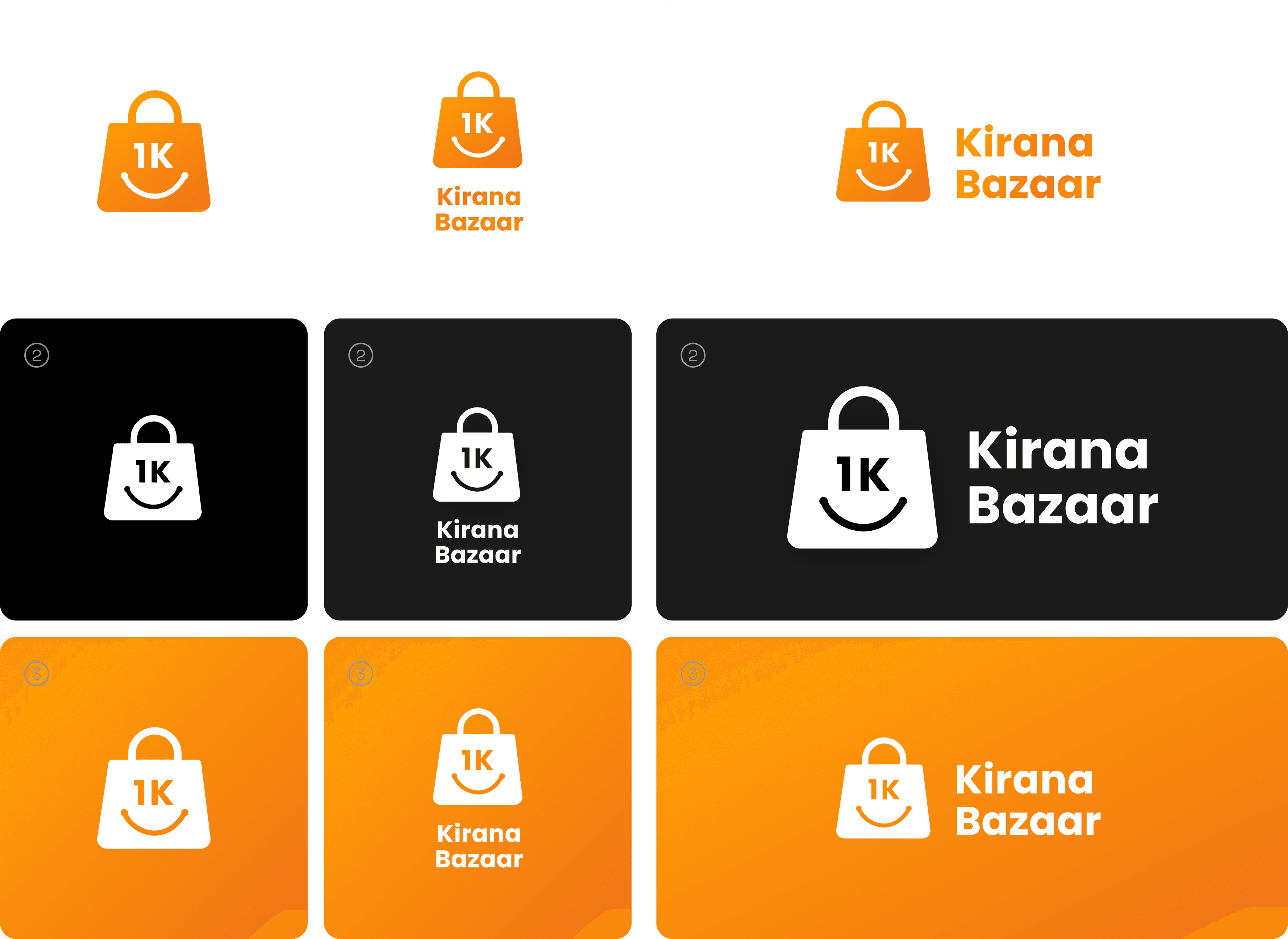
Scalable Logo System — The logo was designed to remain clear and recognizable across both digital and physical environments. Whether displayed as a favicon, mobile application icon, POS interface, storefront fascia, or large-format signage, the mark maintains its visual balance and legibility without requiring alternative versions.
Color Strategy — A warm orange color palette was selected to communicate energy, friendliness, and appetite appeal while providing strong visibility across storefronts and retail environments. The color system also helps improve brand recognition in highly competitive grocery retail settings.
Multi-Channel Brand Identity — The identity was developed for consistent application across shopping bags, packaging, uniforms, delivery vehicles, retail signage, marketing campaigns, social media, and digital products. Every application follows a unified visual language that strengthens brand recognition as the retail network continues to expand.

Single-Color Adaptability — To support cost-effective production across partner stores, the logo was designed to perform equally well in full color, solid white, and single-color print applications. This ensures consistent branding across low-cost signage, packaging, invoices, and promotional materials without sacrificing recognition.
Data Model & Access Control
The identity system was developed around a structured brand framework that standardizes logo usage, typography, color palettes, spacing, iconography, and visual applications across every retail and digital touchpoint. This allows marketing teams, designers, and partner stores to maintain consistent branding regardless of where the identity is applied.
Brand assets are organized for use across digital products, retail environments, print materials, advertising, packaging, and signage, ensuring every new partner store can adopt the identity while preserving consistency throughout the growing retail network.
The Outcome
The completed brand identity gives the Client a recognizable visual system that reflects both its technology-driven retail model and its neighbourhood-first approach. The logo communicates grocery shopping, approachability, and brand recognition through a simple mark that performs consistently across every customer interaction.
As the retail network continues to grow, the identity provides a scalable foundation that allows new partner stores, digital products, and marketing campaigns to adopt the brand while maintaining a consistent experience across every location.


You're one step away from transforming your business growth trajectory

